Playing with Very Peri: 2022’s Pantone of the Year
Every color, in every tone and tint, has a number to classify it which creates the Pantone system. For over 40 years, Pantone has been the go-to color matching system for not only the design industry but also paint, textile and plastic manufacturers.
Since 2000, Pantone’s color experts at the Pantone Color Institute have combed the world looking for new color influences. The selection process requires thoughtful consideration and analysis of trends from the entertainment industry, traveling art collections, fashion, all areas of design, popular travel destinations, as well as new lifestyles and socio-economic conditions. Influences may also stem from new technologies, materials, textures, and effects that impact color.
Twice a year Pantone hosts a secret meeting of representatives from various nations’ color standards groups. After two days of presentations and debate, they choose a color for the following year. This year’s Pantone is Very Peri (17-3938) and I couldn’t help but dream up some fun color palettes using seasonal Colorado blooms.
This is the very first Color of The Year to be created especially for the occasion, celebrating the way our lives have changed with the pandemic and how our collective creativity is expanding to new heights. All previous colors were chosen from the existing colors in the Pantone Color System.


The Pantone Color Institute had a great description and reasoning behind the color choice when they announced it as, “a dynamic periwinkle blue hue with a vivifying violet red undertone blends the faithfulness and constancy of blue with the energy and excitement of red. A new Pantone color whose dynamic novel presence encourages personal inventiveness and creativity, Very Peri, the happiest and warmest of all the blue hues, introduces an empowering mix of newness.
We are living in transformative times. As we emerge from an intense period of isolation, our notions and standards are changing. Displaying a carefree confidence and a daring curiosity that animates our creative spirit, inquisitive and intriguing Very Peri helps us to embrace this altered landscape of possibilities, opening us up to a new vision as we re-write our lives.”
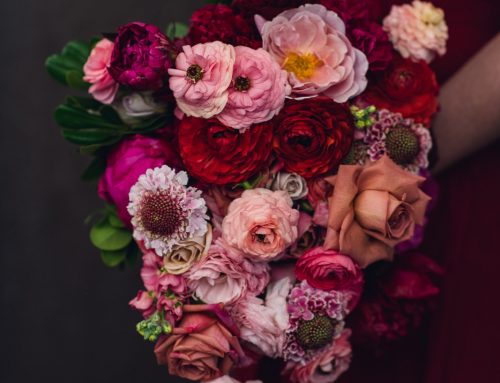
Top Very Peri Colorado Blooms
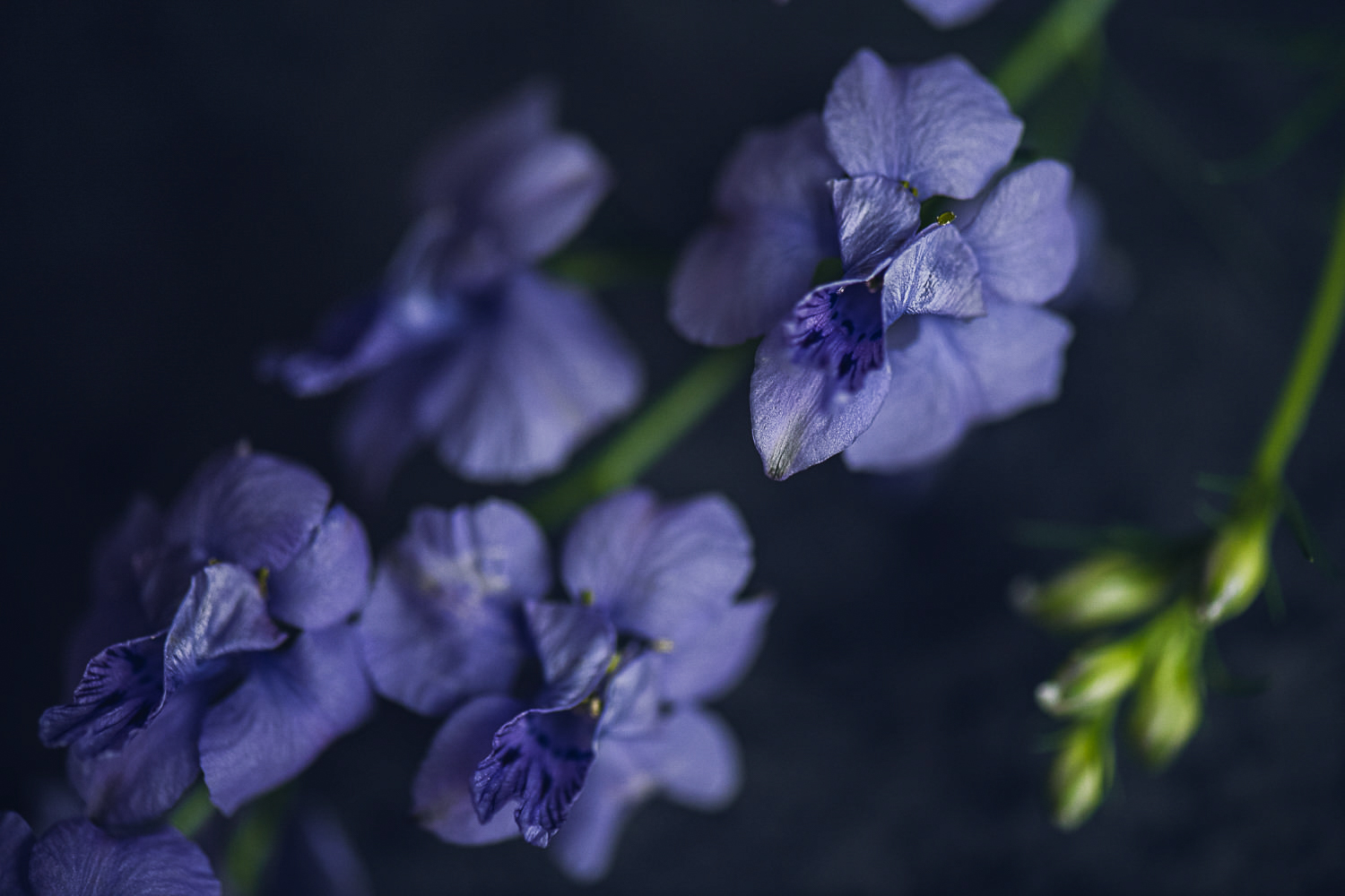
Before I get into exploring some possible color palettes incorporating Very Peri, I looked through all of the local Colorado-grown flowers we’ve photographed over the last 4 years as part of our Seasonal Colorado Floral Guide and found a couple that stood out as the closest matches to Very Peri. Below on the left is a shade of larkspur, the right is echinops, and the above left is salvia – all dead ringers for Very Peri! I also found a few other flowers that had notes of Very Peri which I’ve sprinkled throughout this post including delphinium, aster, and fresh lavender.


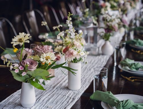
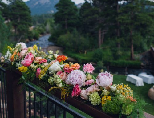
Very Peri Color Palette Inspiration
Very Peri + Vibrant Pink, Peach, Blue, Purples
I love this vibrant June bouquet! The star of the show are 3 different shades of ranunculus along with a touch of blue allium that make the Very Peri larkspur pop and blend to perfection!


Very Peri + Berries
This muted color palette calls to mind blueberries, boysenberries and marionberries. I used Chocolate Queen Anne’s lace, Sedum and Black Knight Scaboisa to pair with the blueish Delphinium as my Very Peri.


Very Peri + Warm Summer
This warm citrus and fruit palette brings on strong summer vibes! I pulled coral ranunculus with a fade to yellow in the center, wonderful pink and lime green lisianthus, light pink peony and a rich purple Ageratum to bring it to life.


Very Peri + Soft Pinks & Blues
To create a soft mix of pinks and blues, I choose blush zinnia, light pink ranunculus and blue tweedia to pair with fresh lavender which acts as the Very Peri flower in this mix.


Very Peri + Jewel Tones
Jewel Tones are one of the color palettes we specialize in here at Wild Blossoms so, we couldn’t resist rich autumn jewel colors paired with Very Peri! We used red Celosia, purple China Aster, orange Safflower, purpley/blue Delphinium to create this jewel dream!


Very Peri + Earth Tones
Very Peri + Earth Tones
Taking Very Peri and blending it with earthy tones also works very well! I pulled lots of neutral blooms and some textural pieces to create an array of earth tones using Sedum, Chocolate Lace, Broom corn, Phlox, Eucalyptus, Poppy Pods, Allium and Veronica.


The Very Peri Year Ahead
Now that we’ve explored some possible combinations of flowers and color palettes that incorporate Very Peri, you can see that it’s an incredibly versatile color! The hue chosen as Color of the Year has become increasingly influential in the vast world of design and brand marketing so I’m excited to see how many 2022 weddings incorporate the cutting edge trend of Very Peri into their color schemes. I’m sure I’ll also find ways to incorporate the spirit of Very Peri into several designs this year and looking forward to December when the 2023 Pantone will be named!
If you’d like to check out the Archive of past Pantones of the Year, you can find them here: Pantone Archive.