Color Theory 101
It’s winter and that means wedding planning season is in full swing here at Wild Blossoms! And a quick search of the most popular times of the year to get engaged tells you why! Check out this list of the top 10 dates for proposals:
1. Christmas Day (12/25)
2. Valentine’s Day (2/14)
3. Christmas Eve (12/24)
4. New Year’s Day (1/1)
5. New Year’s Eve (12/31)
6. Day before Valentine’s Day (2/13)
7. December 17th (Saturday before Christmas Eve)
8. December 10th (2 Saturdays before Christmas Eve)
9. December 23rd
10. Independence Day (7/4)
That’s right – we just had 9 of the top 10 in the last two months! Newly engaged couples are excitedly reaching out to line up all of their vendors and 2022 is shaping up to be a big year for weddings since many covid postponements are now moving full steam ahead. With so many couples planning their events and choosing color palettes, florals, gowns, table-settings and more, we wanted to put together a quick reference guide demystifying Color Theory.


Color Wheel Basics
Color theory encompasses a multitude of definitions, concepts and design applications but the main goal is to create a structure for color. We will look at it in two logical and useful ways: the color wheel and color harmony.
A color circle, based on red, yellow and blue, is traditional in the field of art since it was first roughly developed in 1666. Since then, scientists and artists have studied and designed numerous variations. The modern result is the below wheel that offers a lot of insight on how colors interact, clash and complement each other.

There are a number of ways to break down color using the wheel but the basic ones are primary, secondary and tertiary colors.
Primary Colors: Red, yellow and blue
The 3 pigment colors that cannot be mixed or formed by any combination of other colors. All other colors are derived from these 3 hues.
Secondary Colors: Green, orange and purple
These are the colors formed by mixing the primary colors.
Tertiary Colors: Yellow-orange, red-orange, red-purple, blue-purple, blue-green & yellow-green
These are the colors formed by mixing a primary and a secondary color. That’s why the hue is a two word name, such as blue-green.

Color Harmony and Floral Color Palettes
Now that we’ve touched on the basics of the color wheel, let’s discuss color harmony. Color harmony is something that is pleasing to the eye, engages the viewer and creates an inner sense of order. When something is not harmonious, it’s either boring or chaotic. Extreme unity of color leads to under-stimulation and extreme complexity leads to over-stimulation. Color harmony delivers visual interest and a sense of balance.
Let’s visualize some harmonious color palettes using florals so we can begin to see how Color Theory can manifest through wedding color palettes.
Monochromatic
A monochromatic color palette is one of the most popular and easy to identify. It takes various shades and tints of the same color to establish a lovely color arc. We used purple flowers and pink flowers to demonstrate this effect.


Analogous
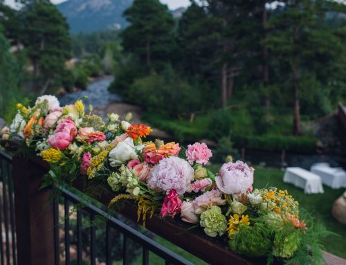
Analogous color palettes are any three colors which are side by side on a 12-part color wheel, such as green, yellow-green and yellow. Usually one of the three colors often predominates. In this example, we used yellow flowers that naturally have strong touches of greenery.


Complimentary
Colors that are opposite each other on the color wheel are considered to be complimentary. We used purple and yellow to create this late spring palette.


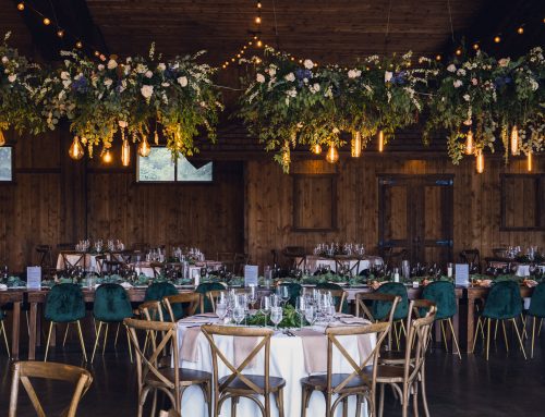
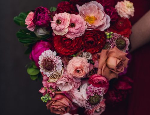
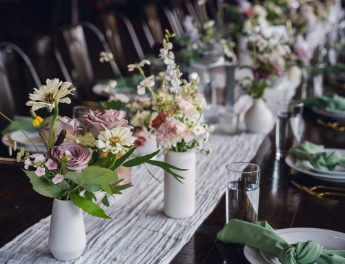
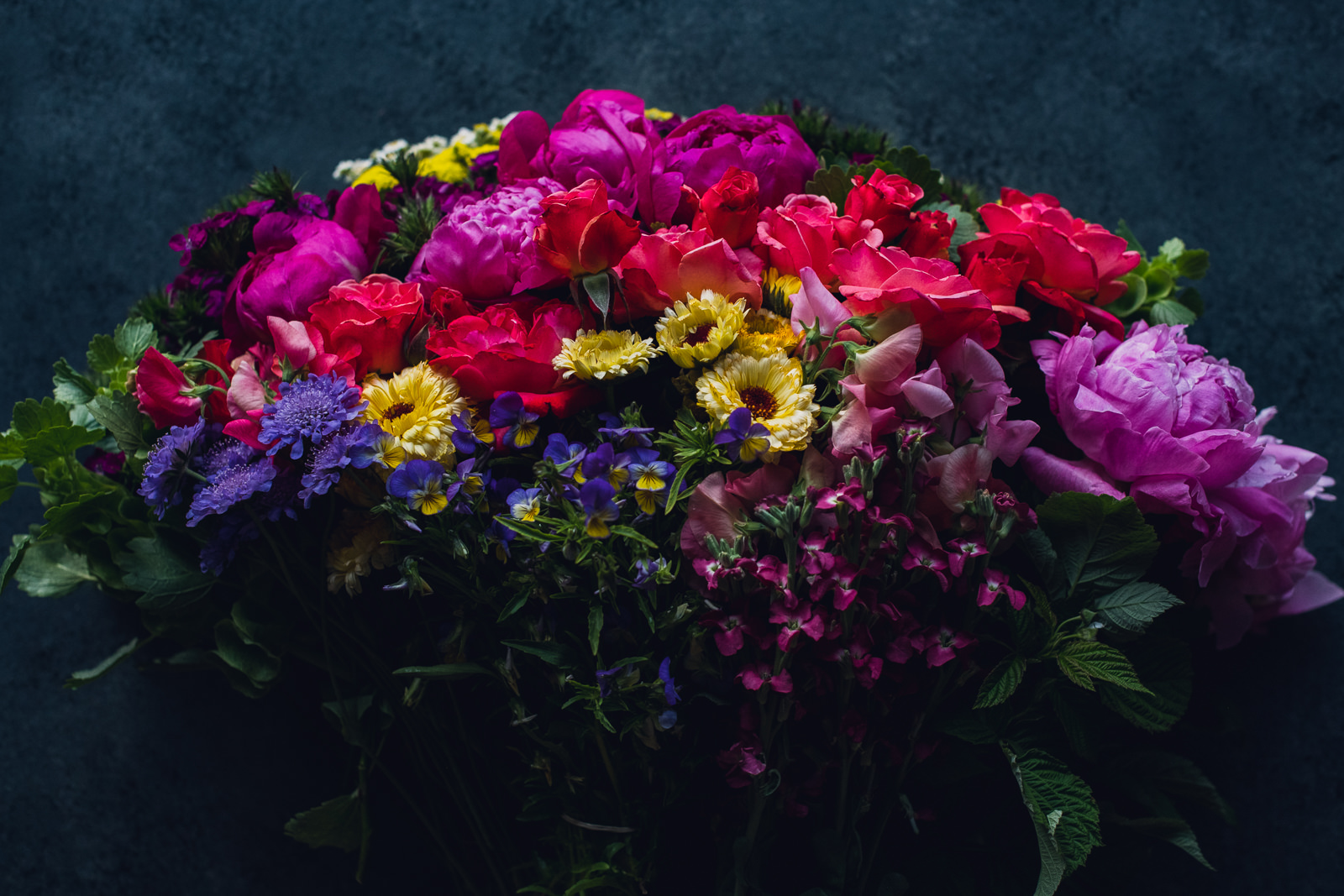
Pastel vs. Jewel Tones
Now that you have some popular options in mind when it comes to color schemes, we’d like to take one extra step towards simplifying Color Theory and floral palettes. Over the last decade, we’ve found that the majority of weddings fall into either a Pastel Color Palette or a Jewel Tone Color Palette. Whether you want something monochromatic or complementary, chances are you’re either drawn to soft, clean tones or moody, vibrant ones. With this idea in mind, take a look at the inspiration categories below and see which ones speaks to you!


Conclusion
With this Color Theory knowledge in hand, we hope your wedding planning goes smoothly and you’re able to narrow down your preferences into a visually-pleasing creation! If you’d love our help to bring your floral vision to life, reach out here!